Cinder-SdfText: Initial Release (WIP)

Hey Everyone,

Just pushed Cinder-SDF: https://github.com/chaoticbob/Cinder-SdfText

Why Cinder-SDF?

  • Texture fonts can pixelate in VR, so the standard practice so far has been to use SDF.
  • Nice to have a cross platform SDF solution. This release is Windows only - I will be adding the support files for Linux and OS X later this weekend or next week. Or you could do it! :slight_smile:
  • Wanted an SDF solution that could handle corners.

How does it work?

Cinder-SDF is a gl::TextureFont like interface wrapped around msdfgen. The SDF data is generated using FreeType curves. Cinder-SDF also uses FreeType to handle both font and glyph metrics for the basic layout operations that it has. This will be extended to whatever makes sense as far as coverage goes.

What are the current limitations?

  • The SDF generator params need to be tweaked so that the render output is smoother.
  • Currently, the SDF uses roughly 32x32 tiles for its data. This may change to 64x64 as params are tweaked.
  • Windows sometimes blocks registry access, so the font scanner fails. Not entirely sure why this happens - probably a Windows policy issue. This manifests itself as a crash at startup.
  • You may also experience some issues with system fonts where the file names are failing in the UTF16 to UTF8 path conversion. I’m looking into why this is happening.

Give it ago, tell me what you think! Submit PRs for other platforms! Submit PRs for tweaks for improved rendering! File any bugs!

Thanks,
Hai

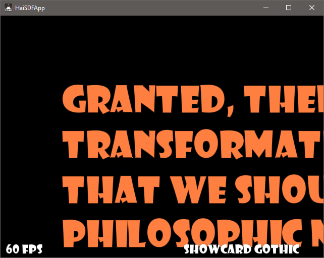
Obligatory Screenshot:

2 Likes

Is iOS somewhere on the roadmap?

Thanks.

Not currently. But I’m sure some clever person can make it work on iOS.

Once you add OS X, I am going to try to compile it for iOS.

–8

Very interesting, Hai!

When I read about msdfgen, I was eager to try for myself, but I haven’t been in the mood for coding lately so you beat me to it. This implementation is a nice first step, although I do see quite a few issues with it in the current version. Please allow me to name a few.

First of all, regarding the ideal font size to create the texture for: while experimenting with my own SDF text stuff, I noticed that a font size of at least 50 pixels (roughly equivalent to 50pt) yields the best results, as this captures most fonts’ details. Only fonts with very thin features, like an elegant handwritten font, need larger font sizes. A size of 24 pixels, which is the default in your sample application, almost never yields great results.

I also noticed that the text still shows a bunch of aliasing, due to a naive shader implementation. Here is what it looks like by default:

By changing the way opacity is calculated, it looks like this:

float sigDist = median( sample.r, sample.g, sample.b ); float w = fwidth( sigDist ); float opacity = smoothstep( 0.5 - w, 0.5 + w, sigDist );

Especially note the difference in quality of the capital “A”. Kerning is not great, the “O” in “Philosophic” for instance seems to float a bit. But that is probably a limitation of FreeType. If not, it might be a good idea to change the way the mesh is created. But I believe that’s something on Cinder’s TODO list, not necessarily yours. Although this one seems to be a bug:

Some fonts exhibit incorrect mapping:

Finally, there seems to be a blending issue: note the grey outlines in the overlapping white text. I enabled pre-multiplied alpha blending in the sample app, but this did not have the desired effect.

If you’re interested, I created a cinderblock.xml that turns your code into a proper Cinder Block. The only manual change required after creating the project, is to add a FT2_BUILD_LIBRARY pre-processor define for all targets. Sadly, this is something TinderBox can not do for you.

-Paul

Not too long ago, it was brought to my attention that fonts layout their glyphs differently depending on the size. So, if you create a font atlas at size 50 and use it to draw text at size 12, it will look different compared to if you generated the font atlas at size 12. I haven’t tested this myself, but seems worth considering for the design. Of course, there are situations where having a ‘one size fits all’ texture atlas is great, like that it uses less gpu resources, drawing the text in a 3D scene, etc.

Interesting, I never realized that. Unless you mean font hinting. But I think it’s correct to assume that, if the text looks great at its original size of 50 points, it still looks great if you simply draw it at a scale of 20% (apart from font hinting that improves readability at small sizes). The fact that signed distance fields actually encode the glyph shapes, rendering text at reduced scale creates new pixels (it does not throw away existing pixels) and looks better than rendering bitmap fonts at reduced scale. See also this link.

Anyway, I should add that using a font size of 12pt for the texture is way too small to capture any details like accents or thin lines.

@paul.houx - Thanks for the great feedback. There’s still a ways to go with this. The primary intent was to have something in VR that didn’t require having a ridiculous amount of gl::Texture fonts hanging around. I’ll incorporate that change to the shader right away.

Font size 24 was probably a bad choice for a 32x32-ish SDF field. Just based on what I know of how the font rasterizers work, I don’t think rendering a font size that’s far under the SDF field is wise. The sampling would break down and cause all kinds of anti-aliasing issues.

msdfgen, by default, an SDF based on a font size of 32. You can change this by adjusting the render scale. Based on what I’ve seen, it scales linearly. This is exposed in gl::SdfText::Format.

I think that kerning issue is related to how the bounding box is measured currently.

@rich.e - Do you happen to remember which font it was that had different glyph information at different sizes?

Cinder-SDF calculates the layout information by using the glyph metrics at the font size that you tell it to. Not at the font size that the SDF is rendered at.

Actually I think this is a misconception. Rendering the text with a scale of 50% and up (compared to the size of the glyph on the texture) should be possible without any degradation in quality. If you go below 50%, under-sampling of the texture may cause the loss of detail, e.g. a thin stroke might break up, but in practice there usually is enough information in the SDF texture to handle scales of 25% or even lower. If strokes do break up, this could be solved by taking 4 samples in the shader (super-sampling), but for performance reason you should only do this if necessary.

What I would suggest for this implementation, is to set the default glyph size to something closer to 64x64 pixels on the texture (or at least 50x50) to capture enough font details, but allow users to change this using the SdfText::Format.Then create the mesh by scaling the vertices based on desired font size (e.g. 24pt = 24/64 = 37.5%). This is how I do it in my old SDF text solution. You can then use a single font texture for all text sizes.

-Paul

@paul.houx I think you misread what I wrote. The case for upscaling is quite proven with SDF. I don’t think anyone argues that. What I was pointing out was that if you went too far below - you would start to see degradation in the sampling. Nothing to do with SDF, just the interpolation of the the textures. And in the same vein of what you’re suggesting with turning up the samples, a traditional font rasterizers do recommend changes (disabling hinting, subpixel, etc) when the size type is too small.

@chaoticbob - I think you and I actually agree and that we both have a firm grasp on the subject. We’re basically discussing the major downside of SDF fonts, which is that you need a large SDF field to capture enough glyph details (I have been advocating at least 50x50 texels), but you need to pay special attention to rendering small font sizes with it. Using a small SDF field for small fonts is not a solution.

Edit: after a discussion with msdfgen’s author, I came up with a better shader that greatly improves text rendering at smaller sizes.

Left: current shader implementation. Right: new shader implementation. Text rendered @ 25%.

(uses 64x64 glyphs, mesh is generated for a 24pt font size, so this is equivalent to a 6pt font size.)

@paul.houx Agreed!

Paul, these changes on the shader are like night and day! The results are extremely impressive! Some of the thin fonts (Courier New, etc) weren’t remotely legible before, and are now.

I’ve incorporated your changes and upped glyph size of 64x64. Also set the alpha to opacity. I can’t tell if it’s doing the right thing or not yet.

I also fixed the tex coord issue you mentioned. Turned out it was the wrapping on the atlas.

I’m still seeing some weirdness on Kristen ITC. It looks like the ‘G’ and the ‘d’ are generating some unnecessary data that’s causing those artifacts. I can’t tell if it’s the parameters getting fed in or if msdfgen doesn’t like the fonts.

Super good stuff!

Hai

Nice improvement, Hai!

I am still playing with it myself and was able to fix the alpha blending. I’ll get back to you about that. In the meantime, try rendering the text with a font size of 6:

mFont = gl::SdfText::Font( "Arial", 6 );

In my case, the text starts to look very funny. I think this is because you’re using integer values for advance and pen, where they really should be floats. Could you have a look at it?

-Paul

P.S.: interesting choice of sample text, by the way.

As promised, here is a fully revised shader for the text. It renders the text with the highest quality, even at very small scales. It also performs well when the text is rotated. Speaking about performance: it’s not a cheap shader, but I think it’s worth it.

vec2 safeNormalize( in vec2 v )
{
   float len = length( v );
   len = ( len > 0.0 ) ? 1.0 / len : 0.0;
   return v * len;
}

void main(void)
{
    // Convert normalized texcoords to absolute texcoords.
    vec2 uv = TexCoord * textureSize( uTex0, 0 );
    // Calculate derivates
    vec2 Jdx = dFdx( uv );
    vec2 Jdy = dFdy( uv );
    // Sample SDF texture (3 channels).
    vec3 sample = texture( uTex0, TexCoord ).rgb;
    // calculate signed distance (in texels).
    float sigDist = median( sample.r, sample.g, sample.b ) - 0.5;
    // For proper anti-aliasing, we need to calculate signed distance in pixels. We do this using derivatives.
    vec2 gradDist = safeNormalize( vec2( dFdx( sigDist ), dFdy( sigDist ) ) );
    vec2 grad = vec2( gradDist.x * Jdx.x + gradDist.y * Jdy.x, gradDist.x * Jdx.y + gradDist.y * Jdy.y );
    // Apply anti-aliasing.
    const float kThickness = 0.125;
    const float kNormalization = kThickness * 0.5 * sqrt( 2.0 );
    float afwidth = min( kNormalization * length( grad ), 0.5 );
    float opacity = smoothstep( 0.0 - afwidth, 0.0 + afwidth, sigDist );
    // Apply pre-multiplied alpha with gamma correction.
    Color.a = pow( uFgColor.a * opacity, 1.0 / 2.2 );
    Color.rgb = uFgColor.rgb * Color.a;
}

As you can see, I also chose to use pre-multiplied alpha and got rid of the background color.

-Paul

1 Like

Thanks so much for nailing down that shader! I’ll incorporate here in a bit.

I took a look at the small font issue as well as the ticket your filed about kerning and position. Hopefully the latest commit addresses the issues you’re running into. We can pick up the discussion on the ticket.

Here’s where I landed with the fixes:

1 Like

@paul.houx Your shader is incredible! Courier New is now fully legible without question! Great work!

And your text layout is incredible! I’d say it looks even better than Photoshop’s! :slight_smile: With the caveat that bold still doesn’t look bold.

By the way: if textureSize is not available (e.g. on OpenGL ES or something), you could use a GL_TEXTURE_RECTANGLE target for the texture instead and use absolute texture coordinates throughout. I know for a fact that the derivatives (dFdx, dFdy and fwidth) are available on most if not all platforms by enabling the right extension, e.g.: #extension GL_OES_standard_derivatives : enable. This means that the shader should run on all platforms, as far as I know.

-Paul

Getting to the style stuff. :slight_smile: Tomorrow hopefully.

@petros asked for a Unicode sample that used non-Latin characters. There’s some artifacts on Vietnamese - maybe on some other languages. The Chinese font was the second choice, the first one had overlap on the strokes.

1 Like

Layout and rendering quality looks super already… Kudos to both of you gents!

EDIT: Greek looks good to me !